When it comes to transforming a space, color is the magic wand every designer wishes they had. The interior design color wheel isn’t just a fancy tool; it’s the secret sauce that can turn a drab room into a dazzling masterpiece. With a swirl of hues, it helps navigate the vibrant world of color, ensuring that every shade harmonizes like a well-rehearsed choir.
Understanding The Interior Design Color Wheel
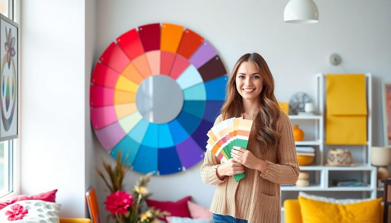
The interior design color wheel serves as a vital resource for creating visually appealing spaces. This tool organizes colors in a circular format, making it easy to understand their relationships.
What Is A Color Wheel?
A color wheel represents a visual arrangement of hues. Primary colors—red, blue, and yellow—form the base, which mixes to create secondary colors. Green, orange, and purple emerge from these combinations. Tertiary colors develop by blending primary and secondary shades. Designers utilize the color wheel to explore various palettes, enabling better decisions when selecting paint or furnishings.
Importance Of The Color Wheel In Design
Understanding the color wheel enhances design effectiveness. It reveals complementary colors, which sit opposite each other, creating vibrant contrasts. Analogous colors sit beside one another, ensuring harmony and cohesion. Utilizing these relationships helps interior designers evoke emotions and set tones within spaces. Effectively applying the color wheel leads to well-balanced and aesthetically pleasing interiors.
Types Of Color Schemes
Interior design utilizes various color schemes to achieve different aesthetic effects. Understanding these types enhances the design process and influences room ambiance.
Monochromatic Color Schemes
Monochromatic color schemes revolve around a single hue, varying in saturation and brightness. This approach creates a cohesive and calming atmosphere. For example, using various shades of blue can evoke tranquility and depth. Designers often incorporate lighter tints and darker shades to achieve visual interest without overwhelming the space. Textures and patterns play a crucial role in adding dimension within these schemes. Space featuring a monochromatic palette can feel spacious and harmonious, making it ideal for minimalist designs.
Complementary Color Schemes
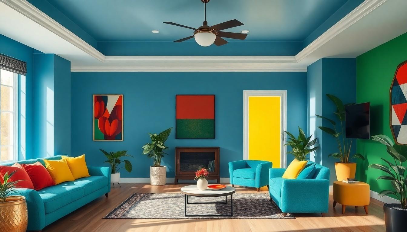
Complementary color schemes utilize colors opposite each other on the color wheel. This combination generates a striking contrast that energizes any space. Incorporating red and green creates a vibrant look typical in holiday decor. Designers can balance bold contrasts by using neutral colors as a backdrop. Implementing complementary colors makes rooms visually appealing while drawing attention to specific areas or features. This approach works well in spaces where a dynamic or playful atmosphere is desired, engaging visitors and residents alike.
Analogous Color Schemes
Analogous color schemes consist of colors that are next to each other on the color wheel. This method fosters harmony and unity, making it pleasing to the eye. For instance, a palette combining yellow, yellow-green, and green can create a refreshing and cheerful vibe. Designers often employ this scheme in spaces meant for relaxation or concentration. It’s beneficial to use one dominant color while allowing the others to support and enhance the overall effect. Such schemes work particularly well in creating a natural, cohesive look throughout a room.
Psychological Impact Of Color
Colors significantly influence emotions and behaviors. Understanding this impact can enhance interior design effectiveness.
Warm Colors And Their Effects
Warm colors, including reds, oranges, and yellows, evoke energy and excitement. These shades often create a sense of warmth and intimacy, making spaces feel inviting. A dining room adorned in warm hues encourages social interaction and stimulates appetite. They also boost enthusiasm and prompt quick decision-making. Designers frequently use these colors in areas meant for gathering, like kitchens and living rooms, due to their energizing nature.
Cool Colors And Their Effects
Cool colors, such as blues, greens, and purples, promote calmness and relaxation. These tones can lower heart rates and create soothing atmospheres. A bedroom painted in soft blues or greens fosters tranquility, aiding sleep and relaxation. Cool shades are ideal for creating spacious feelings in smaller rooms, giving a sense of openness. Designers often utilize these colors in spaces designated for rest and reflection, aiding in stress reduction and overall well-being.
Practical Applications In Interior Design
Color usage plays a crucial role in interior design decisions, influencing aesthetics and ambiance. Designers apply the principles of the color wheel to choose the appropriate shades for each room.
Selecting Colors For Different Rooms
Choosing colors for specific rooms involves understanding their primary functions. For instance, warm colors like reds and yellows energize social areas such as living rooms and dining spaces. These vibrant tones foster interaction and create inviting atmospheres. Conversely, cooler colors such as blues and greens suit bedrooms and bathrooms, promoting relaxation and tranquility. Utilizing neutral colors can balance bold choices in spaces like kitchens, enhancing versatility while maintaining style. Each color selection contributes not only to visual appeal but also to the overall mood of the room.
Tips For Combining Colors Effectively
Combining colors effectively requires a strategic approach. Start with a base color that reflects the desired mood or style of the space. Incorporate complementary colors for contrast, ensuring one doesn’t overshadow the other. Next, focus on accents, using different shades or tones of the base color to create depth and interest. Consider the proportions of each color, maintaining a harmonious balance throughout the design. Lastly, test colors in the actual space with natural and artificial light, observing how they interact throughout the day. These techniques ensure a cohesive and dynamic color palette that enhances the overall design.
Conclusion
Mastering the interior design color wheel is vital for anyone looking to elevate their space. By understanding the relationships between colors and their psychological effects, designers can create environments that resonate emotionally with occupants. Whether opting for bold contrasts or soothing harmonies, the right color scheme can transform a room into a captivating experience.
Incorporating these principles not only enhances aesthetics but also influences how spaces are perceived and utilized. With careful consideration and strategic choices, anyone can harness the power of color to craft interiors that are both beautiful and functional. Embracing the color wheel opens up endless possibilities for creativity and expression in design.